
Module 2B: Computing and Data
Recognizing Misleading Data and Visual Misrepresentation
Chapter Overview
In today’s data-driven world, people regularly encounter graphs, statistics, dashboards, and charts in social media, advertising, news, business, and science. Because quantitative information is often used to shape opinions and influence decisions, it is important to learn how to interpret and evaluate data carefully. Not every chart or claim presents information fairly. Some data displays are confusing, incomplete, exaggerated, or intentionally misleading.
Learning how to recognize misleading data practices helps you become a stronger critical thinker and a more informed consumer of information. These skills are useful in academic work, workplace settings, and everyday life. They can also help protect individuals from misinformation and poor decision-making.
Learning Objectives
Type your learning objectives here.
- Identify common ways data can be misrepresented.
- Explain why misleading graphs and statistics can distort interpretation.
- Evaluate charts, graphs, and claims for accuracy and fairness.
- Distinguish between correlation and causation.
- Apply a critical review process to quantitative information.
Key Terms
- Cherry-picking data – Selecting only the data that supports a preferred conclusion.
- Truncated y-axis – Starting the vertical axis at a value above zero to exaggerate differences.
- Misleading scales – Using inconsistent or non-linear scales that distort comparisons.
- Correlation – A relationship in which two variables move together.
- Causation – A relationship in which one variable directly affects another.
- Aggregation bias – Combining different groups into one summary in a way that hides important differences.
- Omitted variable – A missing factor that affects the outcome being studied.
- Overgeneralization – Drawing broad conclusions from too little or unrepresentative data.
- Visual distortion – A graph design choice that exaggerates or misrepresents values.
Why Data Literacy Matters
Numbers and charts can appear objective, but the way data is selected, organized, scaled, and displayed affects how people interpret it. A misleading chart may not technically contain false numbers, but it can still create a false impression. For this reason, readers should look beyond the surface of a visual and ask whether the chart presents a complete, fair, and accurate picture.
The following examples introduce some of the most common tactics used to misrepresent data. Some are deliberate attempts to persuade or manipulate, while others result from poor design or weak analysis. In either case, the effect is the same: viewers may draw conclusions that the data does not actually support.
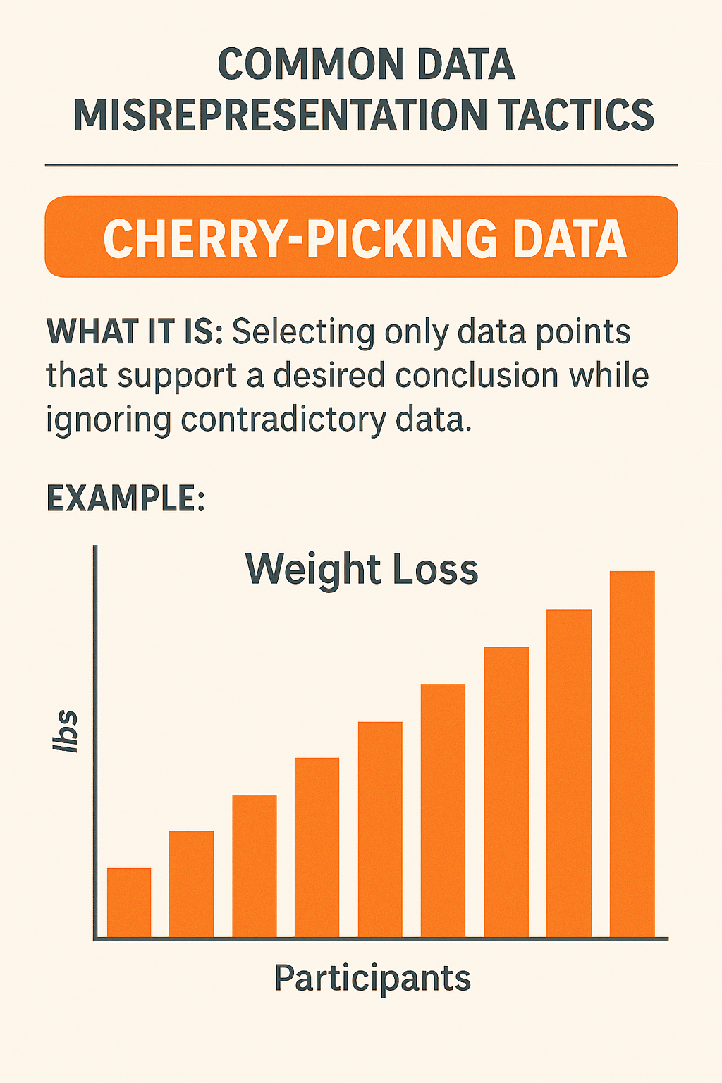
1. Cherry-Picking Data
What it is: Selecting only data points that support a desired conclusion while ignoring contradictory or less favorable data.
Example: A fitness company claims its new workout program dramatically improves weight loss. To support this claim, it publishes results from only the top 10% of participants who lost the most weight, while ignoring the majority who saw little or no change.
Why it is misleading: By excluding the full dataset, the company creates the impression that the program is highly effective, even though most participants may not have experienced meaningful results.
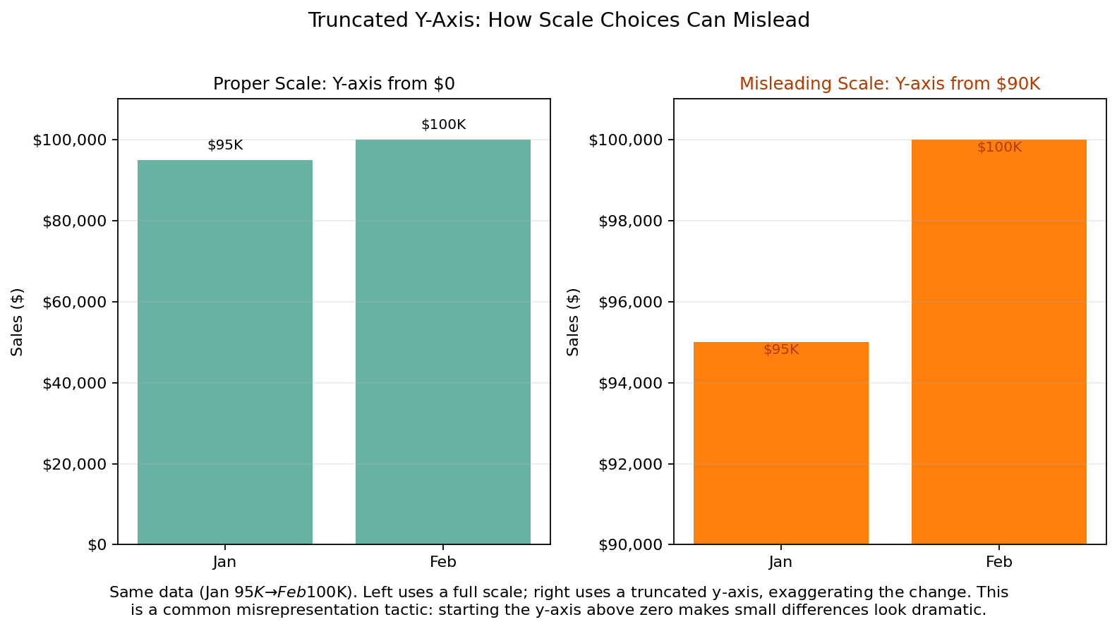
2. Truncated Y-Axis
What it is: Starting the y-axis at a value other than zero in order to exaggerate visual differences between values.
Example: A bar chart showing sales growth from $95,000 to $100,000 may appear dramatic if the y-axis begins at $90,000 instead of zero.
Why it is misleading: The actual increase is relatively small, but the shortened scale makes the difference look much larger than it really is.
3. Misleading Scales
What it is: Using inconsistent, uneven, or non-linear scales that distort comparisons and trends.
Example: A line graph with uneven time intervals can make a trend appear more volatile or more stable than it actually is.
Why it is misleading: Viewers often assume spacing on a graph is uniform. When it is not, the slope and shape of the line can suggest patterns that are not supported by the underlying data.
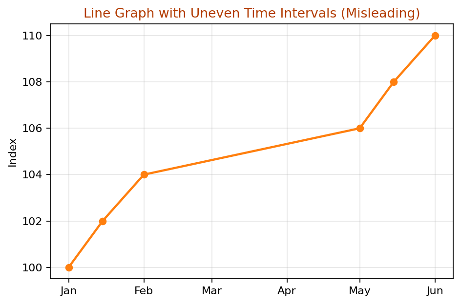
When the x-axis uses inconsistent or non-linear spacing, the slope of the line between points may visually suggest sudden changes or stability that do not actually exist. In time-series graphs, the horizontal axis should reflect true and uniform time intervals unless uneven spacing is clearly explained.
4. Correlation vs. Causation
What it is: Suggesting that one variable causes another when the two variables are merely correlated.
Example: Someone claims that increased ice cream sales cause more drownings. In reality, both tend to increase during summer because warm weather influences both behaviors.
Why it is misleading: Two variables can rise or fall together without one directly causing the other. A third factor may explain both.
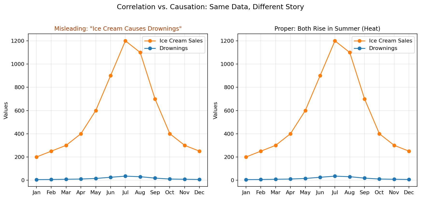
Why this matters: When people mistake correlation for causation, they may make poor decisions, adopt ineffective solutions, or draw false conclusions. Always ask whether another factor could explain the relationship.
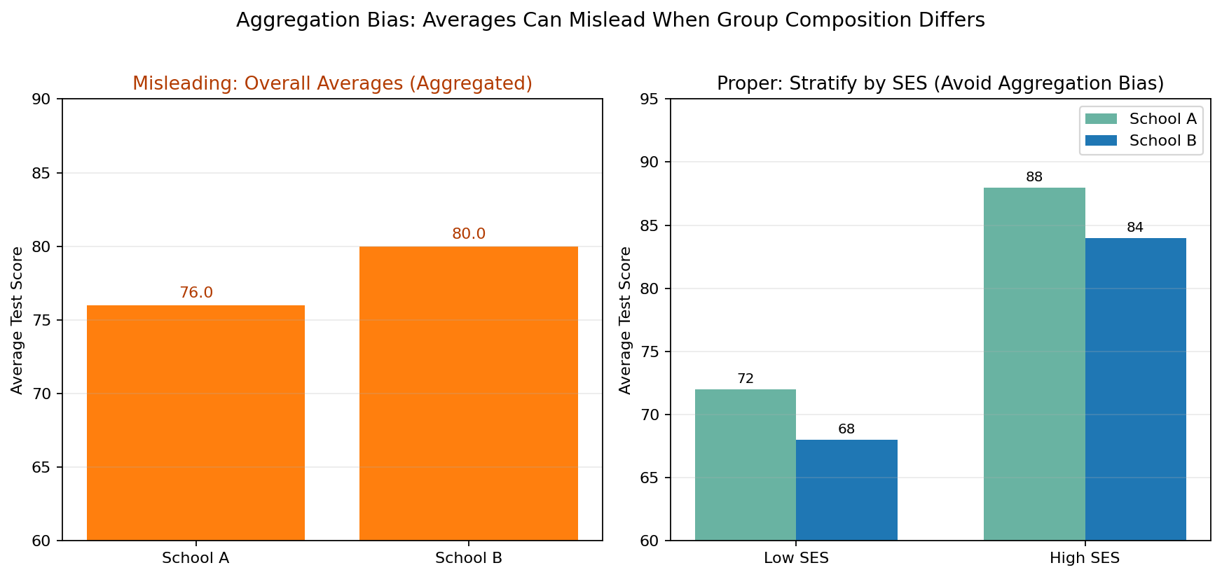
5. Aggregation Bias
What it is: Combining data from different groups without accounting for meaningful differences among those groups.
Example: Averaging test scores across schools without considering differences in socioeconomic status, funding, access to resources, or student support.
Why it is misleading: A single average can hide important patterns within subgroups. As a result, the summary may oversimplify the data and mask inequality or variation.
6. Omitted Variables
What it is: Leaving out key variables that influence the outcome.
Example: A report shows a strong relationship between advertising spending and sales but ignores seasonality, promotions, or economic conditions.
Why it is misleading: When an important factor is missing, the relationship shown in the chart may appear stronger, simpler, or more direct than it actually is.
Why this matters: Leaving out variables such as seasonality, economic conditions, price changes, or promotions can produce incorrect conclusions about cause and effect. This is a common problem in business reporting and analytics.
7. Overfitting or Overgeneralization
What it is: Drawing conclusions from a small, biased, or non-representative sample and treating those conclusions as broadly true.
Example: Using data from one city or one region to make nationwide predictions.
Why it is misleading: The sample may not represent the larger population. A pattern that appears in one small group may not hold true elsewhere.
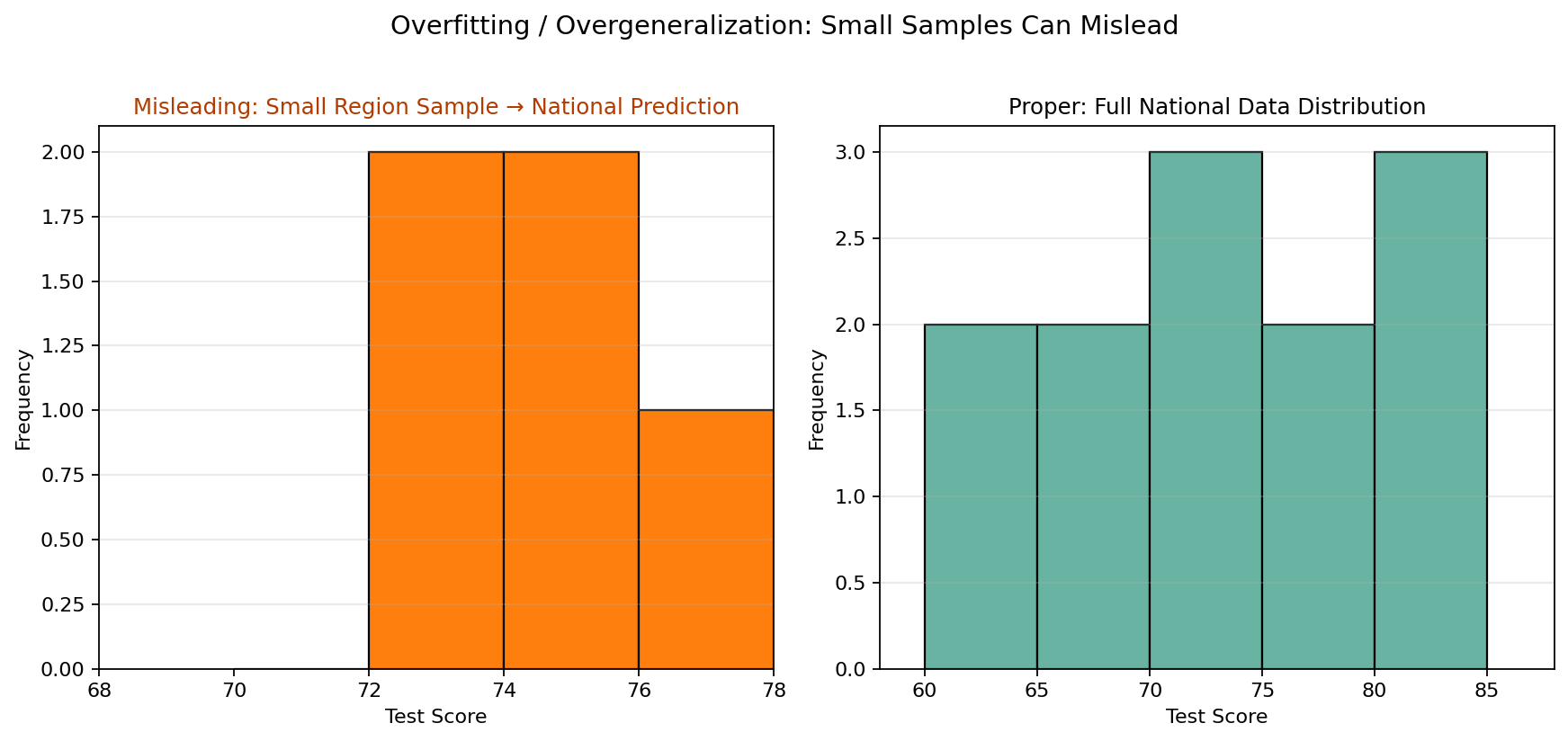
Why this matters: Overfitting and overgeneralization can happen when analysts rely too heavily on pilot data, early adopters, or one geographic region to predict broader behavior. Good conclusions require data that reflects the population being discussed.
8. Visual Distortion
What it is: Using 3D charts, exaggerated icons, stretched shapes, excessive decoration, or inaccurate proportions that distract from or distort the data.
Example: A pie chart whose slices do not add up to 100%, or one that uses 3D effects to make certain slices appear larger than they are.
Why it is misleading: Design choices can influence perception. When viewers focus on dramatic visuals rather than accurate proportion, they may misunderstand the actual values.
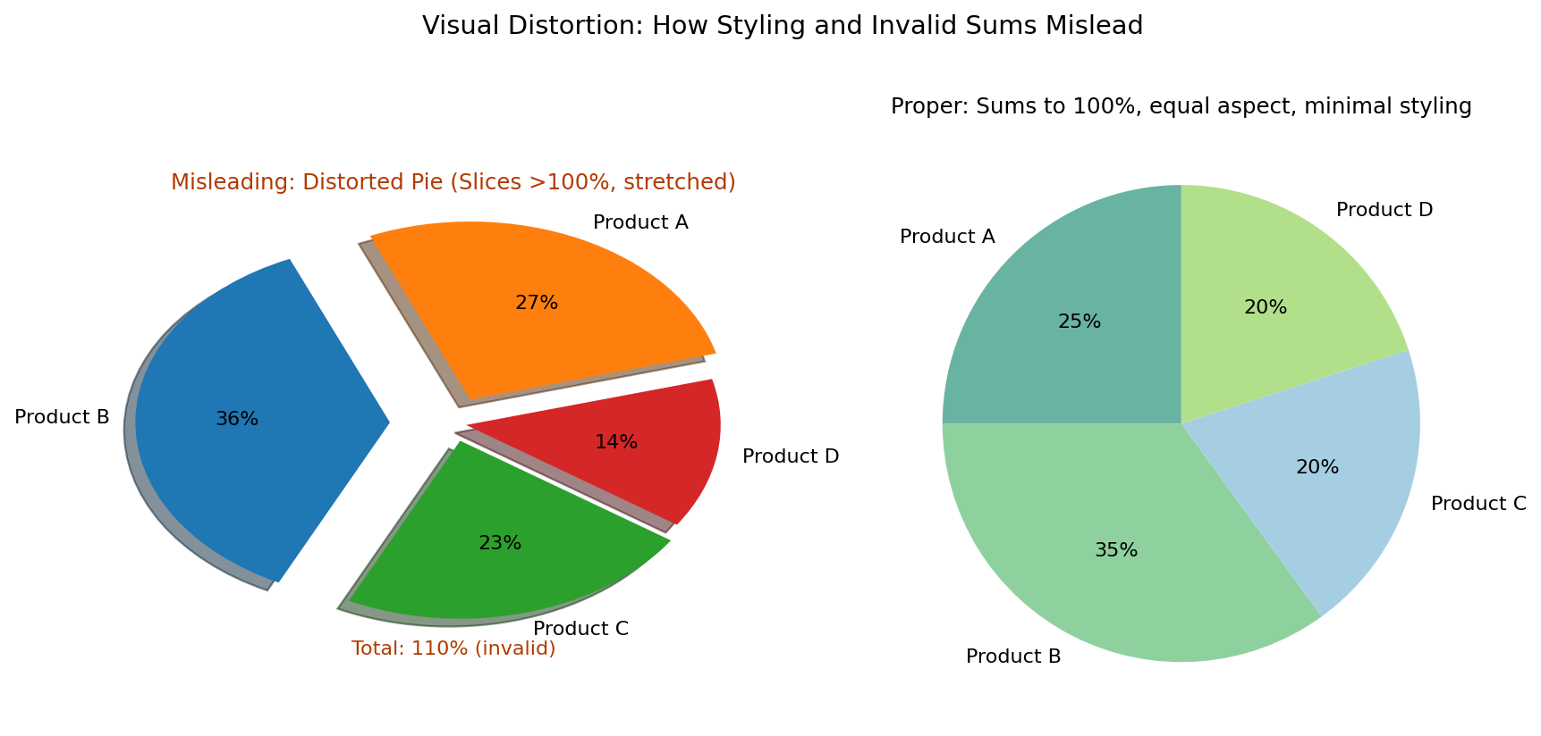
Why these distortions mislead:
- Invalid totals such as percentages over 100% distort the audience’s sense of proportion.
- 3D effects, shadows, and exploded slices can make sections appear larger than they really are.
- Uneven aspect ratios can visually favor some portions of a chart over others.
Quick Checklist for Detecting Misleading Graphs
- Does the chart show the full dataset or only selected results?
- Does the y-axis start at zero, especially in a bar chart?
- Are the scales consistent and evenly spaced?
- Is the chart implying causation when it only shows correlation?
- Are important groups or categories hidden inside an average?
- Could an omitted variable explain the pattern?
- Is the sample size large and representative enough to support the conclusion?
- Do the visual elements accurately match the values being shown?
Applying Critical Thinking to Quantitative Information
When you encounter a chart, graph, or statistical claim, do not assume it is accurate just because it looks professional. Ask questions about the source, the sample, the scale, the labels, and what may be missing. Good data analysis requires both numerical understanding and careful reasoning.
Critical readers compare what a visual seems to say with what the numbers actually support. This habit is especially important in academic research, business decision-making, marketing, public policy, and media consumption.
Chapter Summary
Data can be misrepresented in many ways, including cherry-picking results, truncating axes, using misleading scales, confusing correlation with causation, hiding subgroup differences, omitting important variables, overgeneralizing from weak samples, and distorting visuals. These tactics can lead viewers to incorrect conclusions even when the numbers themselves are not entirely false.
By learning how to identify these patterns, you become better prepared to evaluate information critically and make more informed decisions. Data literacy is not just about reading numbers; it is about asking whether the numbers are being presented honestly and meaningfully.
Key Takeaways
- Charts and graphs can be misleading even when they contain real data.
- Design choices such as axes, scales, and visual effects strongly affect interpretation.
- Correlation does not prove causation.
- Averages and summaries can hide important subgroup differences.
- Missing variables and weak samples often produce flawed conclusions.
- Careful questioning is essential when evaluating quantitative information.
Review Questions
- What is cherry-picking data, and why is it misleading?
- How can a truncated y-axis change the way viewers interpret a graph?
- Why is it important to distinguish between correlation and causation?
- What is aggregation bias, and how can it hide important information?
- How can omitted variables lead to false conclusions?
- Why is overgeneralization a problem in data analysis?
- What are some common examples of visual distortion in charts?
- What questions should you ask when deciding whether a graph is trustworthy?
Practice Activity
Analyzing a Misleading Visual:
- Find a chart, graph, or infographic from a news article, social media post, advertisement, or website.
- Describe what the visual is trying to communicate.
- Identify whether it contains any of the misleading tactics discussed in this section.
- Explain how the visual could influence viewers to draw an inaccurate conclusion.
- Rewrite or redesign the visual so it presents the data more honestly.
Further Reflection
Think about a time when a number, graph, or statistic influenced your opinion. Did you question how the information was collected and presented? What might you do differently now when evaluating similar information?
Attribution
This educational material includes AI-generated content from ChatGPT by OpenAI & Copilot from Microsoft. The original content created by Shelley Stewart and Andy Seeley from Hillsborough College is licensed under a Creative Commons Attribution-NonCommercial 4.0 International License (CC BY-NC 4.0).
All images in this textbook generated with DALL·E and the Microsoft Copilot Image Generator are licensed under the terms provided by OpenAI and Microsoft, which allow for their free use, modification, and distribution with appropriate attribution.
